Saturday, August 22, 2015

Decrease Pollution- Priscilla Pimentel


 Original image citation: (People Magazine, 2013 March, 26)


My original picture is a car because one of the leading causes of air pollution are cars. In my remix, I added a picture of foot of a woman covering the word healthy. The foot is next to a woman who is working out. I did this to show my audience that we should take steps in moving away from using cars. I also wrote pollution is not a solution because it rhymed and those words convey the message of this assignment. The overall purpose of my remix is to show that they are other alternatives to riding vehicles, and that something as simple as walking can help decrease pollution. 

By Priscilla Pimentel

Preparring for the Fall


Original image citation: Better Homes and Gardens, 2014, p.209


As I was looking through a cooking magazine. I found a picture of women sitting on a deck looking out into a lake. the picture was gloomy and it reminded me of Fall. So I looked for pictures of leaves that looked like it was Fall and turned the picture into Fall. As I was putting together the picture, it truly made me excited about the coming fall season. I love the way the leaves change colors and how they fill the streets and tree tops with all the different colors of the season. I wish I actually had real leaves to do an environmental project with leaves.

kheisha


Lets Go Outside

Title of Book: Decorating Your Garden
Author: Pat Ross
Year of Publication: 1998
Page Number: 107

In this remix project I wanted to show people enjoying the environment that they are surrounded by. So I first found this photo that I was very drawn too, which was an original image of a wonderful welcoming bench, that was placed on lovely grounds. For the remix image I wanted it to be funny, but yet understandable. I placed the man and woman smiling and enjoying the environment, in the photo to act as the owners of the property they are on. I wanted to show that people and animals could enjoy the environment and surrounding that they are in. I really enjoy creating these remixes, i think they are a great way to express your own personal ideas.

By: Lindsey Langlais

Thursday, August 20, 2015

Extraordinary


Top (original) : Food Network Magazine November 2014 Volume 7 Number 9 page 4

After flipping through many magazines I came across the top image. I found the words more captivating than the image itself.  The advertisement was originally intended to promote Transitions Prescription Eye Lenses. Although the phrase was intriguing I found the image to be quite bland. Except for the color of the woman's dress and the balloons, the image was actually quite bare and didn't not show how vast and beautiful the outdoors truly is. There was nothing about how beautiful and plentiful the natural world  actually is in the original image. I choose to remix the image eliminating majority of the background. I wanted to keep the structure of the foreground, middle ground, and background while enhancing them. I added elements of the natural world that displayed more color and life. I wanted the remix image to contract the bareness of the original by making it feel more plentiful of life. I think the energy and feeling of the remixed imaged matches the phrase more appropriately than the original image of the outdoors.


- Carla Goodwin

Tuesday, August 11, 2015

Ruby


Original Photo from National Geographic vol.156, NO.3, September 1979
Photo by C.C. Lockwood, Trouble in Bayou Country, Pg. 392 


I chose this image to remix because I have two dogs that I rescued from the south.  One of my dogs named Ruby was rescued from Virginia and she looks just like the dogs in this picture minus the branding.  When I first brought Ruby home she was petrified of humans.  Ruby acted as though she had been abused or neglected.   She was not house trained as if she had been kept outside in a cage.  It took months and lots of treats to earn Ruby's trust.  She is a completely different dog now.  I felt the need to transform these dogs so they were in a safe environment with people who love them and without brandings. 

-Joni Spear

Sunday, August 9, 2015

You Might Need It, But Can You Live Without It?

GQ Magazine (2015), back cover and first page

Remix
As soon as I opened up the cover of GQ magazine, there it was.
BAM.
A full spread advertisement for a 2016 Mazda MX-5 Miata and the subscription reads-
“You may not need it, 
but can you live without it?”
I chose to remix this advertisement in particular for the message that it portrayed; that the car being displayed was a necessity for our lifestyle. While the car was originally placed in a secluded natural environment, this environment was dark and dry. Something that I believed showed little to no respect for what surrounds the car because that little red sports car was the most important thing in the advertisement. I wanted to change the message that this spread demonstrated – rather than putting the importance on the necessary material product of a car, we need to put the importance on the environment that surrounds us.  For without this environment, where does that leave us?
We can’t live without it.
 by Kate Dunlevy

Saturday, August 8, 2015

Peace


Back cover, National Geographic, July, 2015


The image I chose for this remix is an advertisement for a car. There is a lot of destruction happening in the picture; a burning boat, cargo containers falling into the ocean, and there is a man sitting against the car staring at a taco. I chose this image because it annoyed me. The story it is trying to sell is one of adventure, but what it looks like to me is a lot of collateral and environmental damage for a trivial pursuit.

I changed a lot of the image in this remix. I wanted to change the man from someone who carelessly damages the world around him into someone who could experience the world around him and leave it as he found it. I removed the words, the car, and the destruction and replaced them with green space, trees, and a horse. I altered the man so he is leaning up against a tree, it looks like his eyes are closed, and his hands are folded. I used the letters from the words to simply write "peace."

What would happen if we were able to prioritize caring for and experiencing the environment over our many destructive trivial pursuits? Maybe there would be room for a little more peace.

Charlotte Huffman

Sunday, August 2, 2015

Forest, Trees and Nature


For every second, there is approximately one thousand acres of rain forest land that is destroyed. They are many solutions to this problem, but one solution is to plant more trees. In this project, I used symbolism to represent some of the issues and my solution to this problem. One of the symbols, I used was the image of the Ku Klucks Klan member on a tree to represent death. Another image I used is the map of the United States. This image has tiny pictures of crops and the states that primarily grow them. I also used an image of a farming community in India that is being used to grow crops. I used this picture to represent growth. I placed tiny hands and feet to show that if people in our society come together to make this solution possible it will help this nation take steps in the right direction.

Original Image Citation: Citation: New England's Premier Culture Magazine Artscope,  July 15, 2015, P.49

By Priscilla Pimentel

Traffic Control


I chose a picture of a congested downtown area filled with cars. I chose this picture to save the people in the photo from all the pollution. I decided to build an island that detached the city from the more pastured area. My thoughts were to build a walking area for the people. In the area the people have a sitting area and an where you can get on public transportation. Then there is a bridge that provides parking and the other end of the bridge is all the more pastured area.

Original Image Citation: National Geographic, May 2015, page 110
By Kheisha Reid


Visit Disney Forest!


Duncan George, Getty Images, National Geographic, July 2015, Pg. 31


I chose my original image because I love deep woods places and the quiet of nature. I really wanted to be where this photo was taken. My remix shows the original forest from the photo being taken over by development, so that only a tiny bit of the original forest remains, pushed farther and farther away.
I wanted to express my frustration with how beautiful natural places have been commercialized and exploited until the nature of the place become threatened. I think it is so important to conserve natural places in a way that that supports the place itself, not in a way that just turns natural places into tourist destinations.
In the foreground there are figures taking photos and not paying attention to what little nature can still be seen, but the most important figure is a small girl. She is wearing a mouse hat and holding a mouse balloon like the kind you buy in Disneyland. She is looking over her shoulder towards the nature that was lost by the generations before her. She has been given these objects that represent consumerism and she still looks towards that quiet natural place looking for peace.

By Charlotte Huffman

Life Simplified


I really enjoyed remixing an image. I think that this is a great activity to learn about changing our environment and the environment that we are in. This is an awesome way to re-use magazines to create a brand new image. The process of finding an image that you can relate too, dislike or even just like, was an experience in its self. I usually find myself just looking through images rather than trying to make meaning of them.

I chose an image that I really liked and could relate too. The image I chose, is a photo of a sculpture of a round shaped face that was placed on top of a planter that was within a garden. I chose this because I thought it could be about the relationship that human have with nature.

In my remix image I wanted to show the relationship that human actually have with nature. I cut out magazine images of people interacting with nature. Women walking in the woods, watering flowers and even a father and daughter flying a kite. It was great experience creating a new image from an original image.

Original Image Citation: Decorating Your Garden Book, By Pat Ross, Page 185
By: Lindsey Langlais

Back On The Radar

Original
    
 Remixed
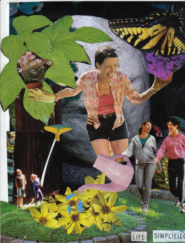
 When I first re-mixed this (what was once a ACE paint) advertisement, I wasn't exactly sure where to start. I originally pulled this from a Martha Stewart's Living Magazine because I was intrigued but saddened by the fact that they were using the beauty of nature to sell paint.  That the simplistic natural beauty of the environment was being industrialized and therefore profited.
So instead, I decided to flip it, putting all of what our environment (and world) consists of and putting them on the radar; in efforts to preserve and save these surroundings so that we can continue to experience them.
From the sky to the sea, the forest to our gardens, from the creatures in the sea and off to the beaches where we roam... protecting our world, protecting our home.
Rather than using our environment to sell a product; we can make the consumer aware of the damage these products may cause and hopefully put forth an effort to save it. 

Martha Stewart Living Magazine (2000), page 131
Back On The Radar by Kate Dunlevy


Family Time


I chose the iPhone 4 advertisement of a granddaughter sharing an image she painted of a beach with dinosaurs. They both look very happy to see each other.  I wanted to remix the image to show them together actually at the beaches a family sharing a real experience.  The phone is a great way to keep in touch with family members that live far away but it cannot compare to actually spending time together OUTSIDE creating REAL memories as a family.  families find it more convenient to spend time together over the phone but it should not replace time spent as a family.  For instance I have seen mothers shopping with their children and they are completely occupied with their phone missing valuable time with their children.

Original image
Sports Illustrated
August 30, 2010

-Joni Spear

Living Well


The image I chose was from Health Magazine. The original was an advertisement for GNC nutritional supplements. The image contained prepackages of pills labeled with words such as strength and recovery. The image bothered me because it was in a health magazine. It seems to contradict what the magazines message should be about. To me, nothing about chemicals should be the first choice to enhance or improve your health, strength, or recovery. All of these things can be achieved naturally, which is what I would expect would be a top priority for a health magazine. I transformed the original image into a building. Using the negative space of the white lines, I created windows. Inside the windows images of natural healthy living are emerging. For example, there are fruit and vegetables, people swimming, children playing , and a woman swimming. All of these things improve your health and strengthen your body through a natural process. I believe that it is important for a health magazine to encourage natural healthy living through natural foods and activity more than chemical supplements.


Original Image-
Health Magazine
April 2014
Page 1

-Carla Goodwin

Saturday, August 1, 2015