Sunday, July 21, 2019

Organized Chaos

Catherine Beaudoin
Environmental Art
Media Remix Project
July 2019
Response to Creation

Original Image: 
National Geographic Traveler, October/November 2018, page unspecified.

Remix Collage

The original image I was presented with is an areal photo of a main walkway in the Chilean capital, Santiago.  The mural itself titled "Paseo Bandera," or "Walking Flag" in English, permits pedestrians to utilize the street for congregation and movement within the heart of the city.
When given the task to remix this image, I was intrigued by the fluidity of the mural within the linear confines of the street.  Expanding this concept into the natural world, I started exploring movement in nature and humankind's struggle for order.
My background utilizes the quadrilateral shape of the street in Santiago within my three other found images.  In each selected piece, I was looking for juxtaposition of curved and irregular lines, shapes, and forms in contrast to more linear and geometric elements.  In the far left, curving branches are woven by machine, line after line, to create the fabric.  Moving to the right of the image, not only is the text written in a linear fashion with straight and curved lines for letters, but the text itself discusses the environment, bio-technical advancements, capitalism, and government.  These paragraphs debate and inquire about both the natural world and human constructs.  The far right component of the background continues this, exemplifying the linearity of human creation and manipulation of the natural world within the symbol of a wooden ladder resting against a tailored green space.
Congregations of people along the beach group and wiggle like an ameba on the bottom left.  The rigidity of the line I created through their space creates a false sense of order within their formation, just as the street in Santiago does above.
I layered a small slice of another mural in a public space in France in the bottom left.  This juxtaposes with the street in Santiago, as the color is now on top of the people and is completely in order in color, shape, and composition.
I pulled this concept into my middle and foreground to draw upon man's manipulation of the natural world.  Produce hangs from a tree-like shape created by a topographic map.  Within the map, we see straight roads and purple patches indicating human-made alterations to the terrain since the map was printed only a few decades before.
The produce on the tree also indicates human intervention, as the naturalistic fruit varies drastically from the corn comprised of various pills for kernels.
My work reflects human ingenuity and the strive for control, uniformity, and perfection in the context of movement and progression.

Mother Nature


My remix draws on the relationship between humans and nature through Mother Nature. She is a figure in several different cultures that embodies the natural world. The original image spoke to me because of the simplicity and beauty of the horse's profile, and I wanted to enhance this by bringing in a human aspect to help people connect. The remix features a side profile of mother nature in line with the horse, surrounded by flowers and with a golden branch crown. The swirls coming out of her mouth remind us that she is always speaking; through the ocean waves,  through the gentle breeze that ruffles fields of golden grain, through the fog that drifts in from the sea. Our current society has operated with the premise that each part of our world exists separate from one another, and we need to remember that we are all part of the same home, Earth.

-Delia Tharnish


National Geographic Travel
Dec 2018/ Jan 2019 pg 119

Think green, wear green


(Image from Macy's Ad, September 29, 2018, Page 5)


The first thing in this image that caught my eye was the multiple animal printed shoes. My first thought was: well, this is definitely not eco-friendly. I tried to find some animals from the magazines we had to address the issue of protecting animals.  By looking at these magazines, I noticed that there weren't many animals I could use but instead there were a lot of clothing images. This brought me a new idea that not wearing animal printed shoes is not the main point of wearing green, but instead choosing eco-friendly materials. Some of the eco-friendly clothing materials I can think of are linen, organic cotton, and silk. I also picked some denim because of the darker the color, the lesser use of bleaches in production. Purchasing dark color denim is a helpful way that we can do for water pollution. Apparels like the fur jacket and animal printed shoes do harm to animals. Paying attention to the materials is another way to protect our environment and ecosystem, for example consuming organic cotton sheets, linen pants instead of polyester pants, etc. Two people wearing in basics represent my personal opinion about some people's closets that there are no eco-friendly apparels except their undies. So think green, wear green. Let's start by looking at our closets and make some changes.


Beautiful wishes or Plastic Pollution?
Shih Ting Kao (Amy)
National Geographic Traveler August / September 2018 Page 85

The idea of this remix media art project is to pull attention to the issue of "plastic pollution" caused by the lantern festival. The Pingxi district, located in New Taipei City, Taiwan, is well known for its Lantern Festival. People can release the sky lantern not only during the annual Lantern Festival time but also in the daily visit to Pinxi.

With more and more aware of our environmental issues nowadays, the environmentalist in Taiwan now trying to bring out the plastic pollution issue in the area. After people released the plastic lanterns with their beautiful wishes, it's not always land in a proper space. Sometimes the lantern will fall in the woods, sometimes into the ocean. It caused a severe environmental problem. 

I chose the image form National Geographic Travel magazine, which has an Asia ocean scene with some trees on the side. I have used colorful tissue papers to express the plastic texture. On the contrary, I added some gold and shinning lanterns that represent how beautiful wishes can end up laying in the water or hanging on the tree. To bring up people's awareness of the responsibility of protecting our environment.


The Transformation


The Transformation
Sarah Kroll
Bloomingdale Catalogue, 2018, p.11


My piece is a juxtaposition between two worlds: nature and consumerism. I transform a dining room silverware set into clashing images of environments that cannot coexist mutually. We are to rid ourselves of our instincts to be in nature and move into a world that idolizes Capitalism and consumption of the earth's resources without taking into consideration the devastating effects it can have. Bright and shiny objects become our new reality as we ignore our natural environment. Our society tells us that the more we purchase, the more happy we will be. We too, can have paradise if we just buy one more appliance, one more pair of shoes, another ring to fit our fingers. Why view mountains, canyons, and oceans in person when we can just see it on a high-definition screen?

Hannah Haber-Remix: Brain Ransom


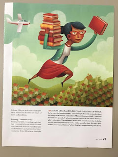
cited: Teaching Tolerance; 2014 Fall [p.21]

I changed the narrative of the image. Truly showing that no one understands what is done in this occupation. That rather than having people from the below homes look out, which would suggest curiosity or mild appreciation, there is no one. This educational hero helps through the decades in schools, towns, and cities a like. The quiet homes suggest there is no appreciation in the work of librarians. The original text has them identified as valued, but no one knows what they do or shows open gratitude. Books are necessary for information and imagination-- and the sometimes overlap of the two. As if to deny your mind the depth of books is to hold it hostage, away from the capacity of discovered potential. I add supposed conversation and comments-- instead of 'Santa' bringing presents on Christmas, she brings books and shares their wonder all year round. This silence isn't because people are watching tv, it is because these people are engrossed in books, or should be. 
I remixed to show more community appreciation and support of the essential help and love of books of this position.

Media Remix - Connect

Athleta Ad, ERB1C1239T, pp. 32.

Connect - Remix

The original Athleta Ad shows a woman dressed for a walk. The woman is walking alone on a vast field of line painted asphalt. Under the woman in large letters is the word, connect. To me this image did not convey a feeling of connection, without the word I would not associate the idea. I asked myself, what is the message in this image? What is she connected to?

In the remix, I wanted to connect the woman to nature. She remains alone but the background promotes connection to nature. The word connect is no longer necessary because there is an implied connection in the images. In the creation of the remix, I layered two different mountain landscapes over one another then added the image of the woman as the last layer.

Stephanie Thornton

Oh What Sun! | Remix - Nadege Tessono


Bloomingdale Catalogue | 2018, Nov. P. 35

The print ad is using this white building backdrop as an example of what winter is like, cold and uninviting. The typography says "oh what Sun" in color using icons to inspire vacation, fun, shopping for summer items to enjoy what the sun brings during holidays. 

I took that concept and remixed it to capture the global experience of the sun and the multiuse of the sun outside of just vacations, beaches and swimwear. The sun is used for energy, cultivating life, physically and spiritually, it's for a celebration of people or used for rituals in different cultures. 

Nadege Tessono


Planet or Plastic?


The original piece was raising awareness about recycling, depicting an ocean wherein there is a plastic bag that also looks like an iceberg. I decided to stay with the original theme of the piece and expand on it. I decided to pit left against right, planet against plastic. The left side is dedicated to all things natural: the forest, skies, trees, and wildlife. The right side is filled with commercialized plastic products that use materials that can be harmful to the environment, many of which will likely find themselves in our oceans one day. The edges of the remix also hold significance. I trimmed the edges of the left side so that the images are confined to the page, just like our forests are being trimmed back into smaller and smaller areas. On the other hand, the right side of the page is flowing off the edges of the paper, just like our plastic waste keeps overflowing and growing to fill our oceans and planet. Lastly, I left the original image in the center, drawing the most attention to the plastic bag/iceberg image that draws the entire piece together.

National Geographic Traveler
Aug/Sep 2018
Page: not shown

Dassi Lipnick


"Leaf" in London


Image Remix from Tianfeng Gu
"Leaf" in London

This original illustration draw my attention to connect environmental art and citizen's daily life.
What I remixed is filling the blank space of the original image with green, vibrant leaves to create a sense of nature. I used paper, fabrics, and leather to illustrate texture. "London", as it shows on the original image, has always informed me an impression of rain. I love rain so much and personally rain is a gift of nature for me to escape from emotion cloud. So I create a red umbrella in the middle with gold little rains. And, the small cat face and puppy paw is connecting with my love of offering better environmental and habitation for creatures other than human in a city life. I wish there could a dynamic flow connecting people with not only the environment we live in, but the bigger range of planet.

Original image: National Geographic Traveler, August/September 2018, page 104


A Touch of Gold


Crate & Barrel Catalogue
Thanksgiving 2018, page 60 


A Touch of Gold
Sarah Peninger, 2019

For this remix project, I took an advertisement from a Crate & Barrel Catalogue featuring an assortment of gold-rimmed wine glasses. I found the original to be bleak and dull, not truly showing off the wine glasses themselves. 
I entitled my remix “A Tough of Gold” because of the text purposefully left as well as the feeling I now get with the remix. I added foliage to the background surrounding emphasizing the glasses giving them a natural setting. This not only brightens up the images but gives better emphasis to the product shown. I added floral arrangements to the foreground to continue the natural feeling that the background provides. I feel that these additions add the right natural elements to the advertisement, instead of having this manufactured space for this product to exist in.


Northern Exposure


Annie Harrington
My image remix was inspired by the text on the front of the page. It says, "embark on the ultimate unplugged adventure to Labrador's remote Torngat Mountains National Park, which lives up to its lnuktitut name as a 'place of spirits,'" (Story and Photographs by Anne Farrar). This quote is ironic to me because as the barren landscape leads you to believe there is minimal human life here in this valley in Canada and yet multiple business have found a way to make money by bringing tours of hikers through the park. By doing these tours for groups of visitors they are required to make camps and take resources from the park which leaves a human footprint on the land however minuscule. I symbolized this intrusion by making the "s" in "Exposure" ad dollar sign because the businesses are making profit off mother nature's beauty. Additionally, many parks similar to this are actually very polluted by acid rain, that's the yellow crumpled tissue paper. The word "exposure", can be seen as the exposure from humans that slowly ruins national parks and turns them into tourist traps. The clouds of words hanging above the valley symbolize the human voices which have the power to destroy these beautiful locations with out even knowing it.

National Geographic Traveler, Anne Farrar, August/September 2018, page 94


A Walk in the Park


The image I started with was an Athleta ad. A model dressed in athletic gear, including shiny silver sneakers was walking in a park with her hands in her jacket pockets. The site, Superkiln Park in Copenhagen, was clearly chosen for the dramatic lines painted on the pavement. From the camera’s perspective there is nothing natural about this walk in the park. No trees. No sky. It is gray and drab and any sign of nature or fresh air has been sucked right out of the atmosphere.

Fast forward to my transformation and you will see the same model is now in a what a park is supposed to be: full of life and fresh crisp air. The model has transformed. Her smile hasn't changed yet she looks happier. She is now stretching her arms out wide, embracing the moment. She is in nature. She moves and stretches. She is alive.


Athleta ad, ERB1C1239T P.46

Kristen Naffah

Comfort for your feet at any event!


IRINA DEY, 
MACY'S AD, SEPTEMBER 29, 2018, P 217

My ad selection was sneakers from a Macy's ad, from 2018. I had a tough time interpreting it at first. I sat there for a while, looking at my ad. My classmates at my table helped me think of ideas. Then my creativity hit, after I thought to myself, "When I wear sneakers, how do I feel? Why do I wear them? And where?" Upon my own reflection, I started cutting out various events where it is appropriate to wear sneakers. I believe that sneakers can be worn in many places, like a date night, after work event, sports, among other places/events. 

Elizabeth Bauman Mixup

National Geographic Traveler, Oct/Nov 2018, p. 82      "Animals with Many Uses"


My magazine image "National Geographic Traveler, Oct/Nov 2018, p.82 inspired me to think about how human's consider animals as entities that are at our disposal to use and own. Animals that do not directly seem useful to humans are often disregarded, considered useless, or labeled a 'problem'. Humans use animals as a resource or as an exotic spectacle to view. This disrespect endangers many species, as habitats are destroyed to further Human gain. I combined both domestic and wild animals to appear larger than life, forcing viewers to consider the roles that animals play in their lives. My work is titled "Animals with Many Uses".
-Elizabeth Bauman

Sara Albunayan Remix

Remix Project 

Fashion and it's impact on the environment 


Fashion has a major impact on the environment and as the industry grows the damage is increasing as well. I used this remix to build more awareness about this issues and if i use it in an art community project it will allow me to start the conversion. The production and distribution of the crops, fibers, and garments used in fashion all contribute to differing forms of environmental pollution, including water, air, and soil pollution. This industry being the second greatest polluter of local freshwater in the world.


The original 
( Bloomingdale catalogue Nov. 2018 P.41) 


The Remix 


artificial Sunglasses, $290.


Our phones, food, and finding the easy way out are distractions from the world, and its problems. These 'artificial glasses' mask us from our surroundings, blinding us, saying, "DON'T LOOK." An excess of phone usage, and over consumption of food is, in itself, a problem as well.

Jack Yarrows
Bloomingdale Catalog: 2008 Nov. 

sink capitalism in the sea // smell like an ocean instead


Sarah Hirsch

Remix image from original advertisement in Bloomingdale catalogue, Nov 2018, p. 77. 
A golden, glittering perfume bottle shines in the middle of the field. Above it reads, "100% EXCLUSIVE" and product information. In the background, blue triangular prisms make for an angular, cool, aggressive feel, in contrast with the inviting warmth of the perfume. 


In my remix, I turn the image sideways, so that the points of the prisms become waves and the varied blues sea and sky. I add in waves and shimmering textured clouds, catching the light.  I use mixed media of different depths and materials, to give a sense of how expansive the open view feels. Golden beams shine out through the clouds from the original round gold of the perfume cap. As a final nod to the image's production origins, I include a cartoon bird, gleefully flying free.